
El Redentor
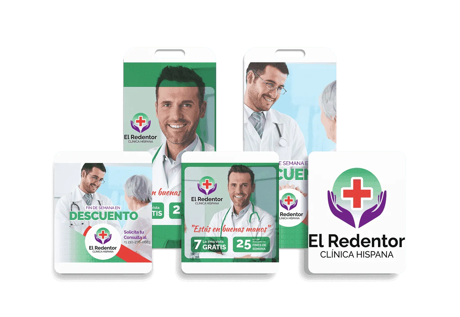
El Redentor is a clinic for the Hispanic community. I made its brand colors, covers and social posts built around its motto, "In healing hands."
What they needed
The clinic wanted a fresh online image. Healthcare brands often get stuck at one end. If they look cold, they seem professional but keep people at a distance. If they look warm, they feel welcoming but less credible. El Redentor needed both, just as its motto "In healing hands" says.
What I did
I set the brand colors: clinical green, white and purple. I used the word "BIEN" (Spanish for "well") repeated as a background pattern. I made the Facebook and Google Business Profile covers, square posts, stories, weekend discount pieces and a medical infographic, all in the same style.
What came out of it
I delivered the color palette, the "BIEN" background pattern, the Facebook and Google covers and the social media pieces.
Project gallery
Want to build something like this?
Tell me what your business needs.